How to write a weekly staff newsletter that at least 80% of teachers will read
Guide
Thank you to full subscribers for keeping much of his newsletter free.
Take care,
Matt
A weekly newsletter can be an effective way to keep your school informed and engaged around your literacy initiatives.
The key word is “effective”. A newsletter written doesn’t mean people will read it. It’s the proverbial “if a tree falls in the woods and no one was around to hear it, did it make any sound?”
Here’s a less-than-ideal example: one of my earlier weekly staff newsletters.
It’s basically a long email in print format. Upcoming events are helpful and the mission and vision language reminds everyone about the big picture, but it’s not visually appealing or inspiring.
Here are the four ways I improved my weekly newsletter over the last dozen years, to the point where at least 80% of faculty and staff read at least part of what was shared.
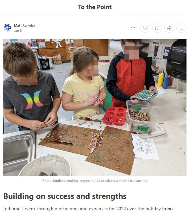
#1 - Start with an image of what your organization is about and strives to become.
I go through my photos app on my smartphone and find an image I captured from the classroom. (If I cannot find one, that is a good indicator that I have not been in classrooms enough that week.)
After securing permission from the teacher and student(s) to post it, I add it to the top of the newsletter. My lens for selecting an image is through the effective teaching practices described in our instructional framework.
For example, when I posted the picture below (a student wrote out and read aloud a joke during morning announcements), I added a caption that touched on the importance of audience and purpose in writing.
#2 - Lead with an anecdote or story.
This first section of the newsletter is my opportunity to share a little bit about my experiences, professional or personal. The more about everyday events, especially depicting me being vulnerable, the better. When I position myself as a learner and mistake-maker, it gives everyone permission to do the same.
In one newsletter, I shared about teaching my son to drive. I portrayed myself (accurately) as a dad just trying to figure it out. Lessons on stopping while ahead and celebrating small wins when learning something new were surfaced at the end.
In another newsletter, I described an assumption I made about a classroom library, and how my conversation with the teacher clarified my misunderstanding.
When I am vulnerable as a leader, I am perceived as more approachable, which helps me build trust with faculty.
(Side note: I keep a checklist to make sure I recognize all faculty members who I celebrate through images and words.)
#3 - Provide general updates.
I briefly list our school's activities, events, and projects in the middle.
Updates are not a dumping ground for anything on the calendar. Minutes from meetings, planned professional development, and upcoming commitments such as evaluation cycle dates always have a space. I embed them here as faculty come to expect this information and to ensure they read it.
This information is concise and easy to read, using bullet points and subheadings to break up the text and create white space.
#4 - Include recommended reading, listening, or watching.
At the end of the newsletter is a summary of a recent article, book, podcast, or video I found useful.
Time is the #1 constraint for teachers. Unfortunately, self-directed professional learning is one of the first things to go in these conditions. By condensing a longer piece of content to key takeaways, I’m giving back a little bit of time to them for learning.
I know at least 80% of our staff read it by looking at the analytics in the free newsletter tool I used (Substack).
One of the benefits of using a dedicated newsletter tool like Substack is all the content is embedded in the email message when you publish it for staff. Less clicks makes your communications more accessible for busy educators. And more readers means the ideas that represent what your school is about and where you all want to be in the future are regularly seen.
Summary
Whether I use a simple word processor template or a dedicated newsletter tool, what makes the difference in getting people to read what I share are the following:
Make it visually appealing.
Keep text brief and broken up (white space, bullet points)
Recognize faculty, staff, and students.
Reduce reading time to the minimum possible.
Include only essential information in the general updates.
Increase the value of the newsletter with professional content relevant to others.
Bonus: Here is the template I use when starting my next staff newsletter:
How do you communicate your school’s literacy mission, vision, beliefs, and values? What strategies do you use to increase your % of people who read what you share?


